Nine Criteria of Breakthrough Brand Experiences
What makes a store more than a store? What makes a breakthrough brand experience at retail?
These are questions that companies with brick and mortar assets wrestle with as they continue to lose share to online competitors or to those with mobile capabilities (smart phone-enabled mobile commerce as well as IRL roving mobile units and other non-traditional formats). I’ve been tackling these questions through the last six months as I’ve audited over a dozen new and interesting retail and restaurant concepts.
I’ve been cataloguing my insights from my audits in a series of Brand Experience Briefs. As I survey my reports so far, I find that the concepts which create memorable brand experiences in their stores have some things in common. Here are nine criteria of breakthrough brand experiences:
1. a clear and compelling brand story and/or brand promise that’s brought to life. Stores need to embody the essence of the brand and make their differentiation and value clear and compelling. The brand history and values are conveyed clearly in the design, signage, and lounge area at Patagonia’s Tin Shed store, while The Habit Burger Grill restaurant fails to express a distinctive brand platform or attributes.

2. target appropriateness. We’re all attracted to people who are clear about who they are. We respond naturally to their self-confidence. Brands are no different. Brands with integrity and clarity are attractive because they don’t try to be all things to all people or to be something they’re not. The 77Kids NYC Style Lab is a great example. Everything about the store is targeted squarely to fun-loving kids. Subway Café, on the other hand, aspires to offer an upscale coffeehouse ambience but that’s not what its customers want, and it doesn’t execute on the concept very well.
3. brand-right assortment. Some of the strongest concepts are filled with tens of thousands of SKUs, while others offer very tailored assortments. There’s no single “right” assortment size or scope – it really depends on the brand strategy. Central Market aims to be a place for foodies, so it makes sense for the store to feature over 700 types of hand-cut cheeses. Starbucks’s new concept stores use local wines and beers to convey the personal, intimate attributes that the company desires for its brand.
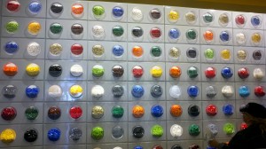
4. interactivity. Although emerging technology has enabled websites to become more entertaining and engaging, brick and mortar still has the upper hand on interactivity. And the concepts that breakthrough are those that use interactivity to make the shopping experience unique, exciting, and memorable. The LEGO store stands out with features like its Pick-a-Brick wall for kids to dig their hands into cubby holes filled with LEGOs of all different shapes and colors. However the Walmart.com store misses important interactive opportunities since many products were not available to try or play with.

5. overt promotion of product quality. Retailers should stage experiences and use store signage and displays to promote the quality of their products. The REI store in SOHO sets the standard for this with its areas that enable customers to try products (like an incline walkway in the hiking boot area); Uniqlo uses eye-catching signage to highlight features of its products; and messages about product freshness are sprinkled throughout the Pie-o-logy location. Steak n’ Shake Signature could learn from these examples, since they have great burgers and shakes but haven’t figured out how best to merchandise and present them.
6. passionate and well-trained employees. Staff who are disengaged (employees at the Walmart.com store seem more interested in figuring out the products themselves than in interacting with customers) or clueless (an order-taker at Subway Café doesn’t know the menu) detract from the experience and damage any hope of brand integrity.
7. distinctive design and décor. The most memorable brand experiences use design and décor to create a sense of place. They take a fresh approach to layout and architecture to create a brand world of sorts, they employ interesting materials for surfaces and fixtures to appeal to all the senses, and they use details and decorations to express the brand personality. REI integrates the historic features of its unique location (the historic Puck building) with digital signage and other contemporary design elements, while Pie-o-logy created its distinctive environment, including mod furnishings and a wall of fun quotes, from the ground up.

8. attention to detail. The devil is in the details when it comes to retail brand experiences. Details like Starbucks’s hand-written welcome message incorporating its wi-fi service communicate volumes – so do the plastic utensils at ihop express and the drab dressing rooms at Uniqlo. Breakthrough retailers sweat the small stuff.
9. extension beyond the four walls. Retailers that extend their brand experience outside their store make a bigger impact and create longer-lasting relationships with their customers. A couple of examples: REI’s active involvement in its community through service projects provides authenticity and personal engagement; the content in Uniqlo’s magalog connects people to its brand attributes and values.

I’d love to hear your feedback. What other criteria contribute to breakthrough brand experiences? What new and interesting restaurant and retail concepts should we take a look at? Comments are open!
Also if you and your team need to re-think your brand experience, sign up for a Brand Experience Day. We’ll head out into the field to experience concepts like these, and then regroup to identify and apply the new insights to your business. Learn more.
related posts: