Google, the Flexible Brand – Part 1
(This is the first of a 3-part series on Google’s unconventional approach to brand-building.)
Google has become one of the world’s greatest brands and it’s done so despite breaking all the branding rules. ![]() Common wisdom says that to build a strong brand you need to present your brand in a tightly focused, steadfast manner. But Google has traded consistency for creativity with its brand. In fact it seems to be practicing an entirely new brand-building philosophy: flexible brand-building.
Common wisdom says that to build a strong brand you need to present your brand in a tightly focused, steadfast manner. But Google has traded consistency for creativity with its brand. In fact it seems to be practicing an entirely new brand-building philosophy: flexible brand-building.
One area in which it’s challenging branding conventions is its logo. Most companies lock in a single logo and develop very strict standards for its usage, allowing no room for even the slightest of modifications. Instead Google embraces various renditions of its logo. It started with modifying the logo on its home page — depending on the volume of search results produced – the more results, the more Os in the wordmark.
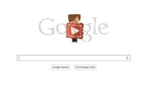
Then it started Google Doodles, those fun interpretations of its logo on its homepage that are based on a timely theme. Google explains, “Doodles are the fun, surprising, and sometimes spontaneous changes that are made to the Google logo to celebrate holidays, anniversaries, and the lives of famous artists, pioneers, and scientists.” What started out as an occasional ad-hoc creative endeavor has become the responsibility of a dedicated team of illustrators and engineers at the company. Over 1000 doodles have been created so far – among my favorites are a recent Valentine’s Day themed one:
and one created to celebrate Dr. Seuss’s 105th birthday:
Last year they furthered the Doodle effort and launched Doodle 4 Google, an annual competition that invites students to submit redesigned logos. Winners are awarded educational grants and trips to an awards ceremony, and their logos are featured on Google’s homepage.
While other brands fear inconsistent usage of their logo will cause brand confusion, Google embraces all these different interpretations – so much so, they’re featured on branded merch like t-shirts and coffee cups that people can purchase.
Some have noted that Google’s business model and scope lend itself to a more flexible visual brand identity. They point to the relatively high frequency with which people see the Google logo compared to a typical packaged goods logo, for example – and this, combined with the brand’s high level of awareness, translates into less need to rely on its logo to make a consistent brand impression.
Google is also credited with having an advantage over product brands because its logo is presented almost exclusively digitally, so there are much lower costs involved with producing more than one version. And there’s also the fact that Google’s logo appears either automatically (the search engine homepage is the default launch page for many Internet browsers) or after the usage decision is made (the logo appears after you decide to do a search and pull up the search engine homepage).
While these advantages may indeed give Google more freedom to flex its logo, I believe Google’s more flexible approach also works because its homepage is so streamlined. Against such an elegant backdrop, variations of its logo don’t cause visual clutter or confusion. And flexibility in branding also makes sense because it reflects the fundamental nature of the Google brand – flexibility.
I’ll discuss this further as well as provide other evidence of Google’s flexible brand approach, namely its brand architecture. Please subscribe to my feed or check back tomorrow for the second installment in this series on Google, the flexible brand.
Listen to this post as a podcast:
Podcast: Play in new window | Download
related:

