brands, generic-style
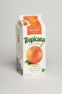
I’ve noticed something lately — name brand food packaged goods are changing their brand visual identities to what seems to me to be a more generic brand look. Following the two-times-is-just-a-coincidence-but-three-makes-it-a-trend adage, I offer 3 examples:
- Tropicana orange juice
old carton design
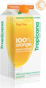
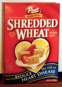
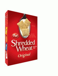
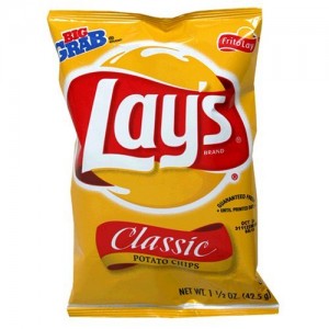
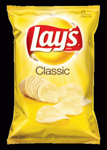
In each instance, the brand name seems to be de-emphasized, while the product type is more the focus. I find this an interesting approach, given the battle between private-label and branded goods. Private-label brands are growing in number and market share, in part because of their increased “branded-ness” — cases in point: Whole Foods‘ 365 Everyday Value brand and Costco‘s Kirkland. And branded goods have been struggling to fight back. (I previously posted about this.)
Are branded goods trying to emulate a private-label look in order to compete more effectively on shelf? Or are they simply going for a more streamlined design and have inadvertently adopted a more generic look? Either way, it’s a curious approach — one that doesn’t make sense to me.
