redesigns that matter
Trolling through recent news from Packaging Digest, I noticed the juxtaposition of two stories that make a great point.
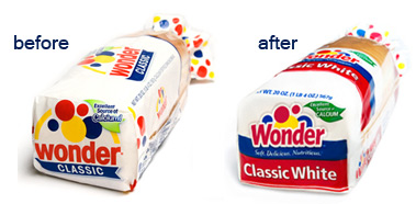
The first story was about a packaging re-design undertaken by Wonder Bread. The change, by Willoughby Design, was intended to evolve the brand to appeal to an older and more nutrition-conscious audience. They adapted the brand’s iconic balloons, fiddled with the typeface, and changed the logo.
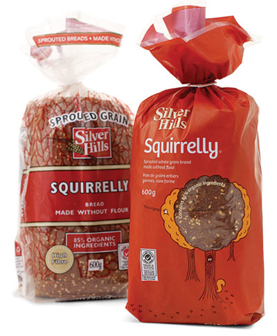
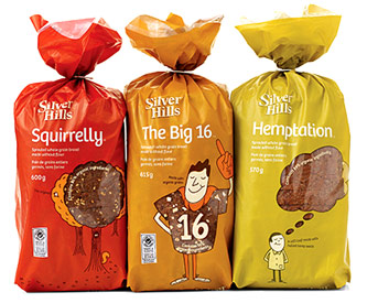
The second bit featured another bread manufacturer that re-designed its packaging — Silver Hill. Silver Hill’s bread line up of sprouted organic breads is also targeted to health-conscious consumers. In this case, though, the folks at Silver Hill and the design firm they hired (Karacter Design Group), took on a totally new look.


The new designs incorporate fun colors, illustrations, and copy, bringing whimsy and personality to a dry (pardon the pun) message about the nutritional value of the products. Importantly, the new packaging stands out on shelf amidst the sea of brown that typifies the bread aisle in grocery stores.
Given that I’m not a design expert, my POV on these two packaging changes is strictly from a brand perspective. It seems to me Wonder has only tweaked a few design elements in such unimaginative ways that any change in brand perception the brand managers were trying to achieve is unlikely to occur. On the other hand, Silver Hill has made a bolder, albeit riskier move that is likely to get people’s attention and prompt a reconsideration.
It seems to me that if a company is going to invest the time and energy to redesign a brand’s packaging, they should make it a change that matters. No?
