brand experience brief: the walmart.com store
(This is the first installment of “brand experience briefs” — insights from my audits of new retail and restaurant concepts.)
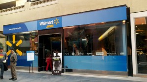
What: the Walmart.com store
- two stores in shopping malls — one store is 3,000 square feet (roughly 1/60th of the size of a typical Walmart supercenter) – the other is even smaller at 1,000 square-feet
- “a small test we’re conducting during the holiday season to offer local customers easier, more convenient access to products” according to a Walmart spokesperson
- open from November 1 until December 31
Where: two stores in Southern California – I went to the one at Horton Plaza, a mall in downtown San Diego popular among tourists
What worked:
- Assortment – The selection was gift-appropriate — primarily toys and electronics.
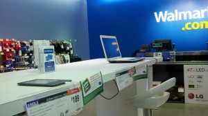
- Hands-on displays – The game consoles and devices were available to try.
- Bright lights and modern fixtures – The store definitely had a more upscale feel than a regular Walmart store.
What didn’t work:
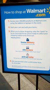
- How to shop – The sign at the lease line was long and confusing (I stopped to read it but no one else seemed to) and the staffers didn’t explain the store (they greeted shoppers with a “Welcome to Walmart.com” but it was several minutes before one of them feebly explained “all of the products here are available to purchase online” as she gestured toward one of the PCs.) The Apple-esque set-up with PCs and tablets was confusing – are customers supposed to use the devices to place orders or are they supposed to buy the devices? Most of the customers looked confused and I overheard one ask another, “What is this place?”
- Displays – Other than the game consoles and devices, most products were not available to try or play with. Plus, the PC and tablet set-up dominated the space so the rest of the store seemed crowded. The products seemed packed in and the displays were standard-issue mass mechant.
- Staff – The employees seemed more interested in figuring out one of the products themselves than in interacting with customers.
What I’d change:
- Clarify the purpose – Make it clear what the store is for and how to shop it. A descriptive line like “Try it here; buy it here or online” used liberally throughout the store would go a long way to helping customer understand and navigate it.
- Align the experience with the strategy — If the point of the store is for people to experience products first-hand, then products should be out of boxes, displays should invite customers to try them, and employees should demonstrate them. If the point is for people to be able to buy products while shopping at a mall vs. making a trip to a Walmart store, then don’t waste so much space promoting online shopping (and don’t sell TVs.)
- Hire differently — This kind of store requires different kinds of workers than a typical Walmart – they need to be salespeople, meaning they need to actively engage customers, soliciting questions and suggesting items.
- Make a statement – Promote the hands-on experience and gift-giving purchase occasion with an editorial voice and visual strategy. Right now the store doesn’t have a distinctive point of view or personality.
Bottom line: Good intentions but poor execution. Plus, while a showcase store for an online retailer is a concept with potential, I’m not sure Walmart needs one.
(Interested in learning how to improve your in-store experience? Sign up for a Brand Experience Day. We’ll head out into the field to experience concepts — good and bad — and then regroup to identify and apply the insights to your business. Learn more.)


