brand experience brief: subway café
(Here’s another installment of “brand experience briefs” — insights from my audits of new and interesting retail and restaurant concepts.)
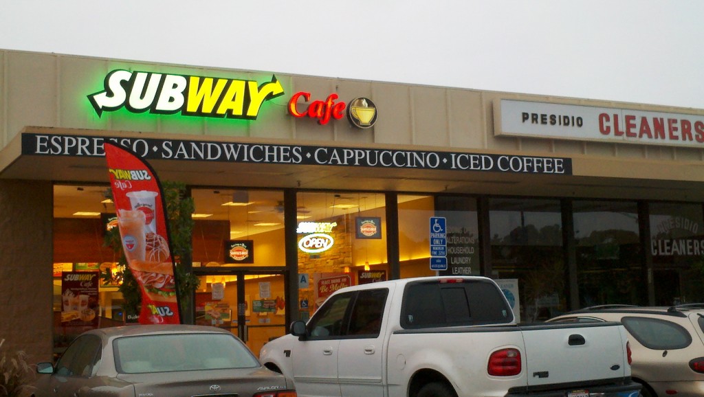
What: Subway Café
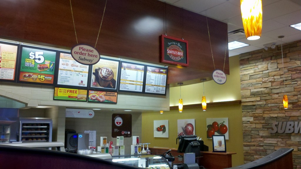
- a test concept featuring (as stated in the company’s press release) “an upscale coffeehouse ambience, an expanded menu, and Seattle’s Best coffee offerings including espresso drinks, lattes and frozen blended beverages, along with amenities such as Wi-Fi, and DIRECTV”
- “There are coffee people out there who like to have their Starbucks but want to have something to eat too,” one of the store managers explained the concept to the local newspaper.
Where: Twenty locations including two stores in the San Diego market – one downtown, the other on the edge of Mission Hills, an upscale neighborhood.
What worked:
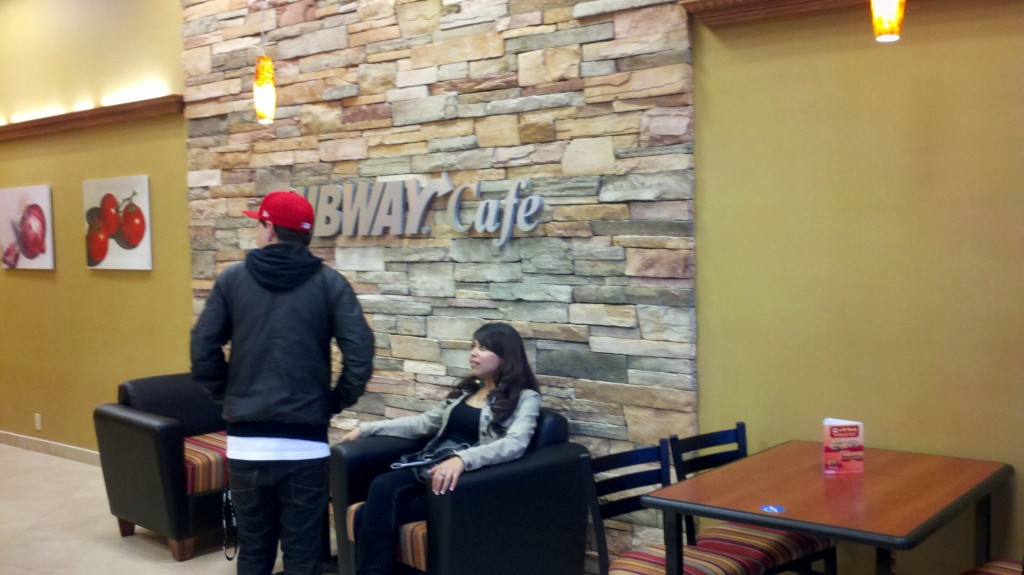
- Décor and fixtures – The only thing that seemed even somewhat appropriate were the décor and fixtures. Instead of the standard Formica countertops and generic fixtures that adorn a regular Subway, the Subway Café featured nicer items. A stone wall made the store seem higher quality than your typical Subway, bar stools and tables gave the place a hipper feel, and the wall hangings were eye-catching.
What didn’t work:
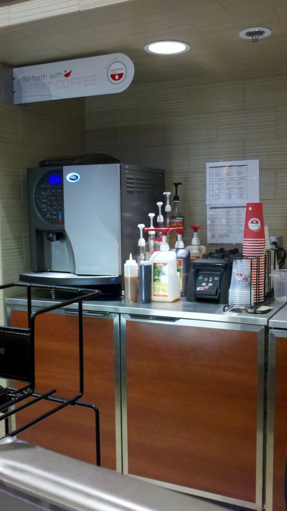
- Product – The coffee is advertised as Seattle’s Best brand, which is a positive association for me, but the coffee drink I ordered (a Caramel Latte) was made in one of those one-cup dispensers and that detracted from the perception — and reality — of quality coffee. That Subway Café uses a machine to make their coffee drinks means they miss all the compelling cues of a standard coffeehouse and the benefits those cues suggest and deliver — no fresh ground coffee, no hand-made product, no sense of real ingredients. Plus the drink tasted awful – and trust me, I am not a coffee snob.
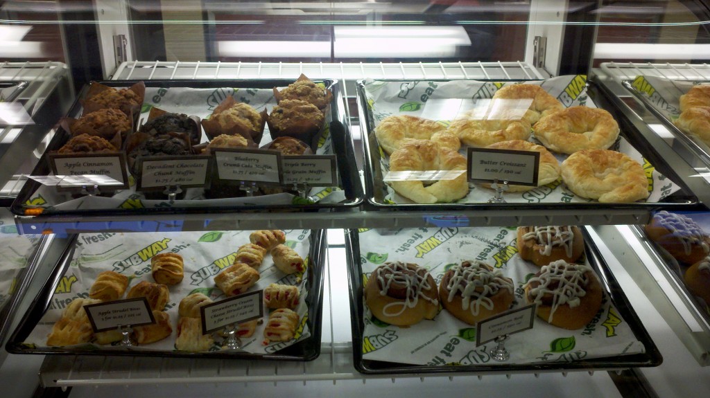
The food selection was equally off-the-mark. The pastry selection, standard and stale-looking, didn’t tempt even my overactive sweet tooth. Plus the assortment skewed toward breakfast items despite my visit taking place in the late afternoon – why not offer more daypart-appropriate items like cookies, brownies, etc.? Or better yet, use those ovens the store already has to make fresh-baked items?
- Training – The employee who served me was not trained. She didn’t know the menu, she had to study the instructions for operating the one-cup machine (really?!), and she couldn’t answer a standard coffeehouse question (“We have half-and-half” is not an acceptable answer to the question “Do you have soy milk?”)
- Brand visuals and messaging – The store was filled with signage for Subway, Seattle’s Best (old and new visual identities), and Tazo Teas, but none of the designs or messages were integrated. Further, the Subway Café logo has no cohesiveness – it looks like someone simply slapped on the word “Café” to the end of the Subway logo. This visual disjointedness detracts from any sense of a concept.
- Overall concept – If Subway Cafe intends to create a “third place” a la Starbucks, it’s got a long way to go. Delivering a coffeehouse experience requires more than putting up some coffee signs and installing a coffee machine. A different level and type of product quality and selection, service, and ambiance is called for. Subway doesn’t have the credibility, nor the executional chops, to go there. Plus, Subway’s primary brand equities are fresh, healthy, and made-to-order-right-in-front-of-you – Subway Café leverages none of these.
What I’d change:
- Shift gears — Focus on building Subway’s breakfast daypart. Subway shouldn’t try to be something they’re not — especially since they’ve got a great concept as is. This new concept is probably intended to offset the sluggish growth Subway will eventually experience, as the chain reaches a point of saturation in most markets.
So instead of creating a new concept, they should introduce a “Breakfast at Subway” program. Offer fresh brewed Seattle’s Best drip (skip the coffee drinks), more breakfast sandwiches and sides (including fresh and perceived healthy items), and breakfast combos. Keep executing the heck out of the grab-and-go experience that Subway does so well – and leave the coffeehouse aspirations to others.
Bottom line: Starbucks and McDonald’s have nothing to worry about.
(Interested in learning how to improve your in-store experience? Sign up for a Brand Experience Day. We’ll head out into the field to experience retail concepts — good and bad — and then regroup to identify and apply the insights to your business. Learn more.)
other brand experience briefs:
